Vibe Check UX
Design proposal for the no-brainer social media feature all non-animals deserve
Marco Giancotti,

Marco Giancotti,
Cover image:
Vibe Check UX mockup preview. Base Figma template source: Talebook, CC BY 4.0
A couple of years ago, I decided to turn off YouTube's viewing history function on my account, the one that records my past searches and the videos I watched. The unexpected result was this:
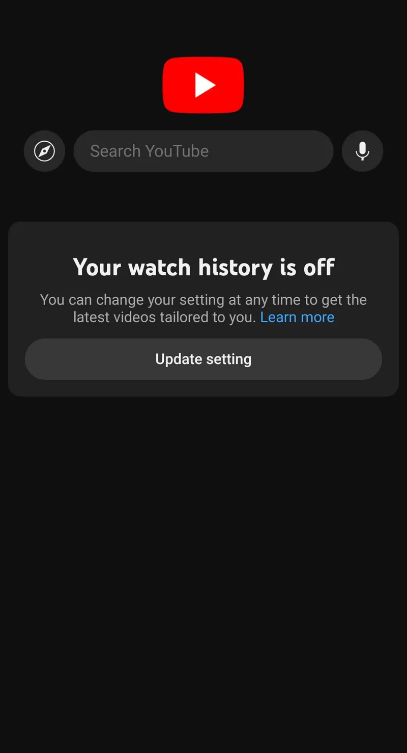
My YouTube landing page is a blank void. There are no video suggestions for what I might like to watch next, no array of the most popular videos in my city, region, or country—nothing.
I didn't mean to turn off the main feed of the platform. Sure, if they are really oblivious to what I watched recently, then they can't make personalized suggestions. But did they really have no other ideas? I'm subscribed to many channels, for instance, and YouTube still keeps track of my likes and my saved videos, so those could be good starting points for the landing page feed. Some people view this all-or-nothing switch as a bully move from Google, a way to bulldozer-nudge users into turning their history feature back on. If nothing else, it is a strong statement on their part.
The thing is, I loved the new landing page. It's the feature I never knew I needed. I have been happily living without a YouTube suggestion feed for years now. That big fat "Your watch history is off" is a serene, quiet greeting awaiting me whenever I open the app, a reminder that I am in control, that nothing will be pushed into my face without my explicit request. Thank you, Big Bully.
Let's be fair, though. The idea of recommending new things that might interest the user is not evil in and of itself. Presumably, people go to social media and content platforms to discover new things. We want to be pleasantly surprised, and an automated, smart curator tailoring the content just for you, just to delight you every time, is an inviting prospect. So why did it feel so good for me to finally turn it off on YouTube?
The reason, of course, is that the feed was never pleasant for me. The signal was almost always drowned in a sea of noise. Irrelevant suggestions, slop, more of the same things I watched and didn't particularly like before. It's not that there aren't many gems on the platform—the algorithm just doesn't seem capable of surfacing them for me.
Crucially, the recommender system often does find things that might interest me, but it offers them when I'm looking for something else altogether. This can be mildly frustrating, like finding only salty food in the fridge when you're looking for sweets, and then, when you're finally in the mood for salty, somehow you only have sweets at hand.
Maybe it's just me. Sometimes I feel like the various algorithms see me as this incomprehensible alien creature, inscrutable and unpredictable, and all they can do is desperately throw random things at me, hoping I'll eventually display some patterns of behavior that they can make sense of. (Bad news, robots: I don't think I'm heading in that direction at all.)
Throttling the fire hose off entirely is a rather extreme way to solve the recommendation quality issue. I can do that with YouTube because it's easy enough to get suggestions on what to watch from other people or links on the internet. It's not really feasible on other platforms like Instagram and BlueSky, though, where each entry is short and transitory. Turning those feeds off, even if it were possible, would mean removing most of the value of their platforms—and I think there is value in them, despite all the glaring issues.
Is there a middle ground, then, between an unpleasant torrent of noise and nothing at all?
I think there is, but it needs to be built into the platforms: every time the user opens the app, ask them what kind of content they wish to see. Not in detail, because they still want to be surprised, but in terms of the kind of vibe they're looking for at the moment.
I'll call this "Vibe Check UX," and I'll develop it as a rough but straightforward design idea below.
The Problem
Social media platforms and entertainment services are riddled with well-known problems—they're too addictive, they're unhealthy, they stunt the social growth of young people, they create false objects of comparison, they polarize opinions, etcetera. Yet, despite all that, I think everyone can agree that these services are here to stay. Sociality and recreation are core human instincts, and nowadays many people—whether it is good for them or not—get those instincts fulfilled mostly online. There is no going back, so the question is how to make them better.
It all hinges on the way recommendation algorithms are implemented. Currently, they consider some cleverly processed mixture of factors like:
- Demographic information
- Which content the user reacted to and engaged with in the past
- What group of users the user is most similar to
- What the user posted recently
These are all behavioral observations. In other words, they collect an enormous amount of data about your behavior, crunch it with powerful computers, and create a simulation of you to find the new stuff that is most likely to attract your attention. And judging by how rich and powerful the companies behind these algorithms have become, these simulations, more often than not, work.
But there is one thing that they all ignore when putting together your profile: what you're thinking about and feeling right now. Some concrete examples from my own experience will help illustrate this point.
I follow many scientists on Bluesky and Twitter, and I enjoy reading their science-related posts... except when I don't feel like it. Sometimes I want a break from thinking about science, but my feed is still full of it because of my past activity. Also, many of the scientists I follow are American, and lately they (understandably) post about American politics all the time—not something I am often looking for.
On Reddit, it is enough to open a post about knitting once to turn my feed into a string-work festival for days: crochet posts, embroidery posts, and macramé posts weave themselves into the fibers of my timeline. The platform kindly allows me to give feedback, and if I tell it I'm not interested in a quilting post, it will mute the quilting community. But it will keep recommending posts from the neighboring felting community, and the appliqué community, not to mention the bargello, lucet, mizuhiki, and quipu communities. Muting them all is more work than just scrolling past, so I end up feeling defeated and overwhelmed by the feed.
On Spotify, I often listen to relaxing music at certain times of the day when I need to wind down, and that seems to convince the algorithm that I'm a very sad and melancholy person. My home page, which Spotify claims is "made just for me," is dominated by this kind of slow, soothing music. Half the time, though, I want to quickly put on an upbeat or experimental playlist instead—something to keep me awake or brighten my mood—but the app only has Satie, Norah Jones, and a playlist titled "Rainy Day Jazz" for me. I have to go and dig something up for myself, hoping that whatever I find won't completely wipe out those calmer tunes from my personal page by the next time I want them.
Then there is Netflix. I will only say that, on any given day, I have only 1% interest in 99% of the shows they claim are a 100% match for me.
You probably see the pattern now. These companies spend millions on armies of brilliant engineers crafting complex AI models capable of profiling me in detail, but often simply asking me what I'm looking for would be enough to improve their suggestions by orders of magnitude—something a junior developer could build in a day.
Now, Just Give Me What I Want Now
The key observation here is that usually the algorithm isn't completely off regarding what I might like at some point, only about what I might like right now. I'm not that alien to them, after all—just too volatile.
The Vibe Check UX I'm proposing simply asks what vibe you're looking for when you open the app. You could answer in many ways:
- "I want to know what my closer friends are up to."
- "I want to engage with my wider circle."
- "I need some comforting thoughts."
- "I want to know what people are saying about politics/sports/cooking today."
- "I want to escape reality for a while."
- "I want to catch up on gossip."
- "I want to discover different opinions."
- "I don't want to think."
This hypothetical UI wouldn't ask for very specific topics, though. There is already the search feature for those, and chances are you want to be pleasantly surprised by the algorithm—the keyword here being "pleasantly." The AI only needs to know what kind of content to prioritize for you, what general mood or type of interaction you're hoping to engage in during that particular session.
The result is a feed that matches your immediate needs, allowing for more intense engagement. In other words, you get more of what you want, and the platform gets more of your engagement. It sounds like an easy win-win to me.
Here, a skeptical reader could and should ask: if it is so good for everyone, why hasn't it been done before? Thank you, skeptical reader, that is a very good question!
You Might Also Like...
My best guess is a mix of factors. First, this might have been technically challenging to build in the past. A general "vibe" is too vague and slippery a property to infer reliably with traditional algorithms. But the recent leaps in LLM and image recognition capabilities should be more than enough to bridge this capability gap.
Another likely possibility is that the analysts and growth engineers in the big corporations did consider the idea of asking for direct user feedback at some point... then decided not to do it.
Perhaps, even though users would be more engaged with the content on their timeline, they would also tend to become satisfied earlier, leading to a shorter total time on the platform. But is this really bad for the platform, considering the long-term view?
Or, perhaps—and this is the cynical and unavoidable doubt—they want people to be frustrated and angry while scrolling, because these emotions lead to more interactions and contagious network effects. A funny meme might elicit only a repost from you, but a single flame war will tempt you into thirty minutes of furious discussion.
Again, consider the long-term engagement effects: what if you could choose between two socials, one where you're angry for two hours every day, and one where you're satisfied for one hour? I suspect that most people would eventually ditch the former. This suspicion is shared by some researchers, too. For example, Agarwal et al. make a very similar point in this 2024 paper, writing that "users tend to return to a platform in the long run if it creates utility for them, while pure engagement-driven interactions may affect user return in the short term but will not have a lasting effect."
Prior Art
Before getting into the actual design of the Vibe Check UX, I'll briefly review what has been done by others in the neighborhood of this idea (I won't be offended if you [skip] this section, though).
I'm not the first to think seriously about using direct user feedback to inform algorithms. Scientists and designers have experimented with variants of this idea in the past, and it's useful to look at them. Based on what I could find, none of those designs are quite like the one I'm proposing, though, for the reasons explained below.
In a recent experiment, Milli et al. studied how people feel about tweets chosen in three different ways: with the usual behavior-based algorithms, with the tweets picked in simple chronological order, and with tweets cherry-picked based on the users' explicit preferences. They found that the explicitly preferred tweets made the users happier and less angry, although they tended to be more conducive to echo chambers.
This study is interesting but doesn't really tackle the question of real-time feedback. For each tweet shown, they asked the participants, "When you use Twitter, do you want to be shown tweets like [@author-handle]’s tweet?" which is different from "What are you looking for in this current session?" Vibe Check UX is about constantly re-tailoring the filter based on user-specified criteria.
There have been many attempts (and actual implementations) of real-time "mood detection" over the years. For example, there are patents for using the smartphone's camera to automatically infer if you're more inclined toward classical or rock music, and patents to use the microphone to interpret the tone of your voice and make content recommendations based on that. I'm ready to believe that these technologies can (somewhat) accurately label my biometric data as "happy," "sad," and other broad emotions, but how much nuance can they extract? When a sensory algorithm guesses that I need some cheering up, can it also determine whether I feel more like watching comedy or people dancing?
The product that seems to best agree with my argument—the need for real-time, explicit-but-fuzzy feedback from the user—is a recommendation algorithm called Taranify, a cool side project of a single developer. Taranify is an AI recommendation system that tries to suggest the best music, movies, books, and other media that best suit your current mood.
One of the blurbs on the landing page reads, "Your Current Mood Matters More! Find what you enjoy now. Not just things similar to your played or listened history." I can stand behind that.
Taranify's process works like this: you are shown a grid of 10 colors and are asked to click them "in the order you feel most to least drawn to at this moment." Based on that ranking, it does some LLM magic behind the scenes to infer your current mood and offer recommendations that, supposedly, align well with it.
This is the verdict after I tried:

To be honest, the recommendations were way off for me. None of its suggestions enticed me to try those products. This is not to blame Taranify in particular, though. As I wrote earlier, the billion-dollar algorithms of Meta & Co. don't fare much better for me. I had no idea how to rank those colors in the first place because they all looked equally neutral to me—perhaps due to my mild alexithymia. I might simply be the wrong subject to try the service. Taranify is a small experiment, and I think it goes in the right direction in many ways, even if it ends up failing on the accuracy side. Especially laudable is the fact that it is completely devoid of tracking or even the need to register. I really hope more people experiment with privacy-friendly ways to recommend content.
Still, this is not what I'm looking for. I don't believe mood will ever be a good way to find appropriate suggestions. It is too coarse and abstract most of the time, as can also be inferred from the fact that the Mood Analysis result in the screenshot above is represented as a one-dimensional gauge. Why make me jump through hoops like that, only to land on this vague estimate of my temper that could be compatible with a hundred different desires? Why not ask me directly—you know, with words?
Let Us Own Our Gaps
The main limitation of all these past attempts seems to be that they always treat people, in one way or another, as if they were speechless animals. They have tried basically everything they could imagine to guess what people want, except hearing it directly from them.
Reducing people to the subjects of ethological observations removes their agency as intelligent beings. Since all we are shown is based on what we did before, consciously or not, the best we can do to retain a modicum of control is to try to "behave better": we might avoid clicking on a link for fear of being plagued with related ads or posts in the following days, or we might spend more time than we'd fancy liking and disliking stuff just to "train the algorithm." And, to the extent that we do often make unconscious choices and errors, we are stuck with them and their consequences. The algorithms study us impassively as we stumble around in frustration.
Now, there is a well-known psychological phenomenon called the "intention-behavior gap" or "value-action gap," and it has been confirmed through many experiments. In brief, it's the observation that people often say they believe one thing but proceed to act against that belief. The most well-studied instance of this cognitive error is the beliefs around climate change: many people claim to be worried about climate change but fail to do their part in fighting it. This gap is also well known in the world of product design. One of the first maxims I learned as a product manager was: "Don't ask the customer what they want; look at what they do." The reason was (supposedly) demonstrated by Henry Ford when he said, "If I had asked people what they wanted, they would have said faster horses."
Humans are animals. Observing someone carefully for a while will tell you a lot about them, including things that they themselves are not aware of. As long as they are used ethically—a big "if"—algorithms that analyze user behavior are a good idea with a lot of potential. That's not where the problem at hand lies.
The problem is assuming that those unconscious behaviors that the algorithms can partly anticipate are all there is to the person. The problem is assuming that those unconscious behaviors are even desirable for the users displaying them.
When I say, "I don't want to see this topic again," I actually mean it, even if I end up clicking it again the next time it comes up. When I think, "I need some energetic and cheerful music," and you recommend me Debussy or lo-fi playlists based on Yesterday Me, I'm not going to listen to them. And even assuming I have this great inner contradiction where I actually want the opposite of what I think I want, let me learn about it. If you can see right through me, help me see through myself, too, so that I may perhaps find a way to reconcile!
Behavioral data shows what you might do, not why. Did you click on that Reddit post because you love that subreddit's topic, or is it because a friend posted it, your partner told you to, or you were doing some research that you have since abandoned? An observer is not going to guess it just from my actions, even if they know your mood. No amount of behavioral data is going to allow them to guess a human being's real, conscious intentions. Search is the solution when the user knows exactly what they want, but often users arrive with vague but confined needs.
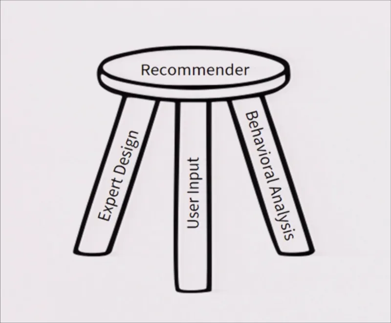
We need a way to discover content that is based both on behavioral data and on our stated intents, as some researchers (like Ekstrand and Willemsen here) have already suggested. The explicit desires of a user need not be the only criterion, but they should be the starting point from which the recommender system begins its clever arrangements.
Vibe Check UX
With that out of the way, here are the two key requirements for a Vibe Check UX:
- Transience by default: Assume that the user's goals for using the app will change every few hours, and sometimes every few seconds.
- Conscious control: The questions should focus on conscious needs and wants, not mood and tendencies.
I'll show this with a generic image-sharing app as an example, although the same approach can be applied to any other kind of recommendation system. Start with a behaviorally personalized feed like this:

Then ask what the user wants:

Here, it's important not to create too much friction for the user. Adding something more distracting, like a popup window, might confuse and discourage them from using the app altogether. The question is clearly visible at the top, but if the user wants to ignore it, all they have to do is flick one finger to scroll down.
Still, the Vibe Check function should always be conveniently accessible somewhere in the UI. In this prototype, it is represented by the "I want..." button in the bottom bar.

When the user clicks on Start (or on the "I want..." button), a list of preset options appears. These should be chosen based on the choices the user made in the past or on choices popular with other users if there isn't enough personal historical data yet. When they submit their choice, the user will see an updated timeline focused on the desired vibe.
But the best thing for the user, of course, is to specify exactly what they want, even if it isn't on the list yet. The LLM will handle the rest.
Remember that this algorithm isn't meant to function as a search engine. Even when given a specific request like "puppies and babies," it might—and probably should—expand a little on that, for example, by showing penguin chicks and other things within the same category of cuteness. The user will enjoy being surprised, as long as the vibe stays on topic.
There may not be an infinite number of recent posts with the desired vibe, though. What should the algorithm do when it exhausts the appropriate material? The ideal option is to simply tell the user to take a break from scrolling. The evil option is to quietly begin feeding them more and more off-topic stuff, plunging them back into the usual frustrating experience.
The more realistic option, I think, is to conduct another vibe check.
How can we mitigate the risk, as suggested by the Milli et al. paper, of creating even stronger echo chambers with this UX? Favor more generic keywords, like "relax," "follow sports," "banter," and "politics," and block the opinion-related ones, like "Democrats," "criticism of XYZ," and so on. This should help prevent people from diving too deeply into their own bubbles, although how well it works ultimately depends on the underlying algorithm.
Conclusions
You could develop these ideas further with more features: the ability to make certain choices permanent, to mix and modulate these wants like a DJ, and to set predefined schedules, to name just a few. But the quick and dirty sketch above should be enough to show the simple core of the Vibe Check UX concept.
Again, this is not meant to replace the existing algorithms based on behavioral data, but to inform them. As much as I would love to see the engagement industry simply drop its obsession with making people scroll endlessly, realistically speaking, none of the big corporations is going to do that.

Short of regulatory China-style interventions that radically limit this dynamic, we have to work within the system. So, if many users are going to remain glued to their phones, we might as well treat them more humanely, like the intelligent agents that they are, and make their time on the platforms more worthwhile. I'm not claiming that this is the best way, in the long term, for people to engage with social media: it is a feasible improvement. ●
Cover image:
Vibe Check UX mockup preview. Base Figma template source: Talebook, CC BY 4.0
 Technology
Comments
Loading comments...