A Medium-Agnostic Taxonomy of Notifications
Or, I Went a Bit Too Far Fantasizing About the Ideal Notification UX
Marco Giancotti,

Marco Giancotti,
Cover image:
Photo by Super Snapper, Unsplash
Main intended audience of this post: people interested in UX and information management.
Notifications are part of the fabric of modern reality. They wait for us to wake up in the morning. They nag at us to stay awake at night. Throughout the day—every day without end or hope for an end—they rain upon us, vibrating our thighs, overlaying themselves on the other things we're doing, interrupting our meals, disturbing our fellow theater-goers, always pulling our hands towards our devices even without the need to emit any signal, even without the need to exist, by the mere possibility of existing.
To me, that means that we should study notifications as something as important as, say, politics, which has a larger impact on our lives but not nearly at such a granular, perennial, visceral level (your mileage, of course, may vary).
This is not a rant against the evils of notifications. Sure, commercial providers have all the incentives to flood us and consume our attention (are they the real "consumers", in this sense?), and they take no prisoners. But if we use notifications so much, it's because most people need them or like them. For those who don't, it's easy enough to shut them out altogether. What really interests me is how to throttle them by degrees.
The best of both worlds—the world of buzz-slavery and that of asceticism—is, of course, to filter out the useless notifications and only pay attention to the ones you need. That is easier said than done. Some notifications are useless now, but might be useful in the future, and vice versa. Some notifications need to be checked before knowing if they're useful, and some must only be checked now and not later.
What follows is my thought process as I put my product manager hat on and attempt to make sense of all those intricacies. I also try to come up with guidelines and hints for managing one's own floodgates and with a wish list of better UX design.
Your Dog Invented It, Too
Someone wrote, near the top of the Wikipedia page for "Notification System":
Within the 20th century, one of the most important scientific breakthroughs has been the invention of notifications.
This is not what I expected to read, being wrong in many ways, but it still works as a starting point.
One thing that stands out in that sentence is the idea that notifications are a scientific breakthrough. Notifications are not what I would categorize as a scientific advancement. Maybe the author is referring to all the psychological research that corporations are doing to push their products in front of our eyes, but—even assuming we can call that science—that's not how notifications were invented.
Before all of the attention hacking began, notifications existed as honest ways to inform people of things they actually needed to check. That, of course, started well before the beginning of the 20th century. Cell phones in the nineties had little LED lights that blinked to notify you of messages and missed calls. The first SMS was received by a Orbitel 901 (wired) phone in 1992 and, although I can't find more details about it, it must have had some way to show it had arrived. Answering machines had light-based notifications at least as early as the 1970's.
But the more you try to look back for examples, the more you realize that what we call a "notification" is, at its core, something much more universal and ancient than the little icons that come to mind today, perched up there at the top of a smartphone's screen.
An email sitting in your inbox is a notification, and so are the recent posts in a social timeline, and even a ringing phone. Is it limited to modern technology, then? No, because a letter made of paper, in your home's mailbox, serves exactly the same function, and as such it's another instance of notification. A mother calling her children for dinner is a notification. Your dog whining to get out for a walk, too, is a notification.

We're just using a new-sounding name for something that is, literally, older than humanity itself: information meant for you to consume. Notifications weren't "invented" any more than aggression or feeding were "invented". The only thing that changed is that, in the 20th century, we have a lot more of them.
Unless we look at notifications from this broader perspective, as special cases of a kind of phenomenon that transcends any medium, we can't fully wrap our heads around them.
As a first step, I'm going to define three axes to classify notifications. Then we'll see what are the most reasonable actions for each class of notifications. Unfortunately not all of those actions are easy on a smartphone or PC today, so I'll conclude by offering some ideas for better software UX for each of those actions.
(I later edited the Wikipedia sentence cited above into "The widespread adoption of notification systems was a major technological development of the 20th century.")
Step 1: Eisenhower, but in 3D
So, in the broadest sense, notifications are simply "information meant for you". You're expected to check them. Whether it's someone else who wants you to look at them, or you requested them yourself, doesn't matter very much. They're notifications if they come to you to be looked at. So, should you?
As always when discussing framings, there isn't a single or "right" way to categorize notifications to make them more manageable. Different framings will work in slightly different ways, and the important thing is that the framing you choose is useful "enough". Instead of reinventing the wheel, then, we can find a framing that has worked well for similar goals, and try to adapt it to this one.
One framing that has helped me in the past is the Eisenhower matrix, or Eisenhower method. It's so popular on the internet that I don't think I need to explain it in depth. It divides your pending decisions into levels of urgency and importance. As Dwight Eisenhower put it:
I have two kinds of problems, the urgent and the important. The urgent are not important, and the important are never urgent.
We can use this with notifications, but there are two important adjustments to make. First, the Eisenhower matrix is usually explained as a decision-making framework. While handling notifications is a form of decision-making, the matrix is usually explained in the context of management and teamwork. For example, you're told to "delegate" urgent-but-not-important decisions to other people. In the following sections I'll adapt the concept a bit for the specific case of notifications.
Second, there is a whole dimension to notifications that is not captured by Eisenhower. It has to do with how quickly or easily the notification disappears after reaching you. We could call it the transience axis.
Thus we get a three-dimensional space to think about notifications: the space of urgency, transience, and importance. What can it do for us?

The Urgency Axis
Some notifications are intended for you to see as soon as possible, while others you could ignore for a while without consequences.
As an example of the latter extreme, think of a fire alarm ringing in your house or a tornado siren when you're in Kansas. On the non-urgent end are things like new videos from a Youtube channel you follow.
Note that urgency is not the same thing as importance to you: it's only about how soon you need to see the message for it to fulfill its purpose. A one-day 80% discount off your favorite lip cream may be urgent, but probably not very important.

In general, you want to be able to control which notifications you get based on their urgency. You may want to get the urgent ones as soon as possible, no matter how busy you are, and silence the less urgent ones until later. You're controlling notification urgency when you stick a long-lasting discount coupon to your refrigerator, and when you configure your calendar to send you a reminder email the night before an important event.
You don't always know the urgency of a notification before looking at it, so you're often forced to look at many less-urgent ones, just in case. But you sure would like to know. On the other hand, marketers love to create a false sense of urgency. Only a third party can mediate this tension, which is why I think we should have protocols in place to clarify the urgency of each notification. More on this later.
The Transience Axis
The second axis is transience, or "how temporary is the notification?"
The most transient notifications are extremely ephemeral, disappearing shortly after reaching you, perhaps even before you had the time to look at them. Radio programs are very transient, because they keep going whether you understood what they said or not. There is no pause or rewind on a radio. The winkers of a car in front of you are transient, too, because they might go out at a moment's notice.
At the other extreme, the least transient notifications are the permanent ones, which will stay there in your face until you do something about them. Physical mail in your home's inbox will keep on piling up and won't go away unless you take action yourself. A death threat painted on your shop's shutters over the night is something you can't easily dismiss either.
Phone calls were originally completely transient notifications. Either you answered immediately or their contents were lost to you, shrouded in mystery. Then they invented things like caller identification, which shows you the number of the caller, and voicemail, which stores people's messages for you to listen whenever you want. Effectively, these inventions added less-transient notifications to the innately ephemeral ones of ringing phones.
How transient you want your notifications to be depends on your tradeoffs. Too permanent and they'll pile up, take up your physical or mind space, and become a burden. Too ephemeral and they'll pass right under your radar and you'll never know you missed them. In general, it's best to have less transient notifications for information that is important to you.
The Importance Axis
This one is the clearest, but the trickiest to classify. Importance is very subjective, and potentially any message, regardless of format, could be important or not. In theory, something that affects your life and that you can do something practical about is important, while the rest isn't.
You're the only one who can assign things along the importance axis. By definition, unimportant information should have low priority, and ideally you want to eliminate it altogether from your life. But you may want to access some of it for your enjoyment, curiosity, or archival reasons.
Step 2: Charting the Landscape
Following the matrix approach, we can now divide each of these axes into two sections (urgent/non-urgent, transient/permanent, important/not important) to get eight combinations. Drawing these in a fancy 3D plot would be confusing, so I'll use two urgency-transience matrices, one for non-important notifications and another one for the important ones.

Urgent & Transient Notifications
Non-software examples:
- Someone asking you a question
- Sirens (when they affect you, e.g. you're blocking an ambulance's way)
- Earthquake alerts on your smartphone
- Screams for help
- Street signs when you're driving
Software examples:
- "A live stream is happening now!"
- A "looking for group" message in a social RPG game
Urgent notifications, by definition, have a short expiry date: they lose meaning if you look at them too late. That's why it is often acceptable to keep them transient.
Any urgent & transient notification can be important to you or not, and that affects what you should do with them. Important urgent & transient notifications are what you want to dedicate all of your attention to, right now. They should override basically anything else, so they need to be in your face, loud, and give you all the information you need immediately.

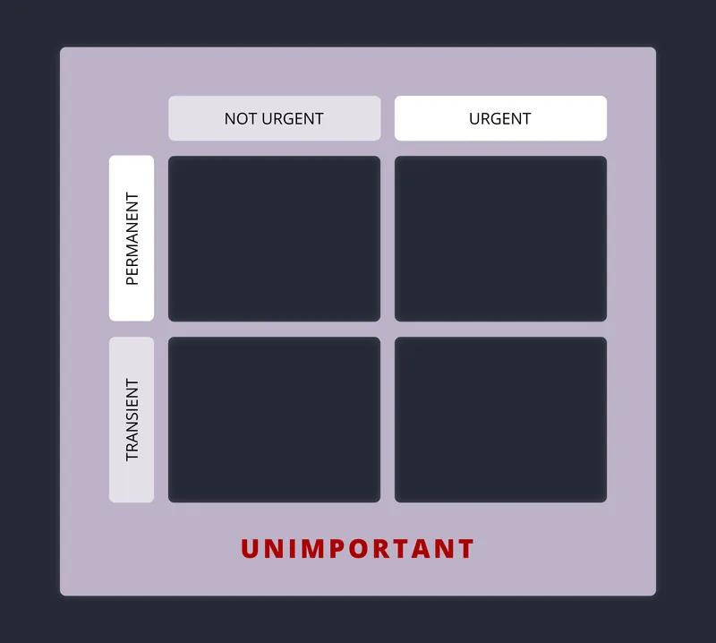
Unimportant urgent & transient notifications, on the other hand, are completely optional. If you don't want to remove them altogether, then you want to get them in a non-intrusive way, somewhere you can find them when/if you wish to, but that doesn't get confused with the important ones. If they go away before you see them, never mind. You'll never know and never feel much pain for missing them.

Urgent & Permanent Notifications
Non-software examples:
- Suicide letters, blackmail letters, letters/emails about approaching expiration dates
- Newspaper delivered to your mail box
- Voice-mail asking to call back ASAP
Software examples:
- Chat conversation you're participating in
- Emails from your boss
- Blog post in your feed reader/inbox about a new concert with tickets quickly running out
There is no use, in general, in having urgent notifications that keep existing after you've looked at them, except perhaps a sentimental or record-keeping value. In the latter case, they're probably important for you.

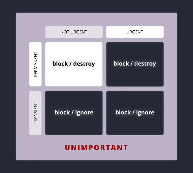
As for the unimportant ones, you need to get rid of them once you're through with them, or prevent them from reaching you in the first place.

Non-Urgent & Transient Notifications
Non-software examples:
- Brand ads on the street
- Most overheard conversations
- Spotting a flock of birds making strange patterns in the sky
- Sounds of the city
Software examples:
- Bad task reminders ("oops, I swiped it away, then forgot all about it!")
- Time-bounded social-media posts (e.g. Snapchat)
- A nice picture or sentence that hit you while browsing the web
Almost every moment we spend in society, we're flooded by transient, non-urgent notifications. They compose most of the noise in our lives. Thankfully, they go away on their own.
The important ones are a problem. You may miss them, and live to regret it. In general you want to take note of the important ones before they go away, for as long as you need—until you have time to act on them. In other words you'll have to devise ways to catch and convert them into permanent notes.

Unimportant non-urgent & transient notifications are something you can safely ignore. Look at them only when you really have nothing better to do.

Non-Urgent & Permanent
Non-software examples:
- Most letters, promotional leaflets in your mailbox
- Storefront signs in your area
- Books on your shelves
Software examples:
- Those eternally-open tabs in your browser
- Most emails, chat messages, and social-media posts
- Good task reminders ("it's staying there until I tick it off.")
These are the things that we need to spend the most time managing, otherwise they will drown us. Most of us, it seems, are losing this battle.
Important non-urgent & permanent notifications may not need immediate action, but they need to be there when you eventually want to do something about them. For this reason you need to organize them well, store them neatly. It is easy for them to slip through the cracks, or to be forgotten for a little too long. The temptation is to keep them all, but space and memory are finite: it's often better to assign deadlines to them, act on them, and then destroy or archive them.

The unimportant ones are your enemies. They are the invader weeds. They constantly threaten to sideline the important ones, and can get in your way. A complete waste. It's best to block them as much as you can, and destroy the others. You may want to keep some of them for entertainment or sentimentality, but do it at your own peril. (This is more of a problem with physical notifications, but care is needed for the digital case, too. See below.)
Step 3: Better Notification UX
The Core Actions
The Urgency-Transience-Importance framing makes the kind of actions we need clear. In broad strokes, we need eight kinds of actions: destroy, ignore, check now, block, archive, organize, set deadline, and convert to permanent. But do our devices support those actions?
In part, they do. Check now and ignore come for free: everything is built around allowing you to check things immediately, and ignoring is as easy as scrolling down a little or looking away. While the granularity offered varies, all OSes also let you mute notifications either temporarily or permanently. I treasure this ability and exercise it aggressively.
Fortunately most apps also give you ways to destroy things. You can delete emails and chat threads, put files in the trash can, and so on. Archiving functionality is also very common, although not as much as it should be, in my opinion.
You could argue that many digital objects like emails and chat messages don't even need deletion, because they "self-archive" simply by remaining there in a sequence. In a sense, it's as if they were deleted, because you don't need to give them a second thought (unless you hit your email provider's storage limit). It's also nice, in theory, to be able to go back to them if you ever wish to.

There's a hidden cost, though: those thousands of past interactions soon pile up into a huge haystack you have to sift through. This becomes a deterrent against your searching for specific things from the past, and defeats the purpose of keeping them. Most of the time, it's safe and a better idea to delete.
There is one aspect of the destroy action that, I feel, hasn't been explored fully yet. Recall the urgent & permanent notifications. If one such notification is even a little bit important to you, you will want to keep it for a while, but you may want to get rid of it once its expiration time comes.
With the current UX of most programs, you're forced to wait until the right time, and then delete the message. This is fine and even preferable in many cases (they act like checkboxes that you "tick" by deleting them), but there are cases where you're not even sure if you want to act on them. Think about the time-sensitive news in your inbox. Maybe you'll get around to reading them in the weekend, but if you don't, you're okay to skip.
In this case, wouldn't it be nice to have a "scheduled removal" function? You see the notification, you think you might consume it later, but not after a certain date. So the notification sits there, waiting for you, but it "shows itself out" when it's become obsolete. No further action is needed from you unless you want to.
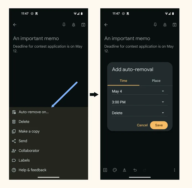
This might only be a minor improvement, but I think it shows how this framing can help generating new UX ideas.
Steering the Flow
Given the constant assault we're under, blocking notifications is perhaps the most critical action for our sanity, and it's well supported across the board. In most apps, you can filter out emails with custom rules, you can unfollow accounts, and you can explicitly block them.
However, according to the Urgency-Transience-Importance framing, the biggest factor in deciding whether to block something or not is its importance, not the source!
Most people and apps say things that are unimportant to you 90+% of the time, and only sometimes produce something that you consider important. Blocking whole accounts seems like too blunt of a tool and a great way to miss opportunities.

The ideal blocking feature would be some way to filter out based on a customized "value function" that only lets the things you might care about reach your attention. Using deterministic algorithms would never work. AI is more promising. I don't think it's feasible just yet with the current state-of-the-art AI, but I think we're very close.
Next in line is organizing, the thing you do to make your important, non-urgent stuff easily accessible. This is an extension of mere archival. We have lots of tools for this one:
- File systems let you structure data into hierarchies, which are easier to navigate.
- Indexing and search is the specialty of databases. If you know exactly what you're looking for, indexing is all you need to find stuff really fast.
- Tagging lets you transcend the strict limitations of folders, and makes search easier.
- Cross-linking, like wiki links to other pages, is a powerful and quick way to organize things in a more organic way while keeping it semantically navigable.
- Snoozing is a relative newcomer to the arena, but one of my favorites. It allows you to archive notifications not (only) based on their contents, but on when you'll need to see them again. You can forget about them until they pop up again at the right time.
- And more.
Yet, I consider organizing an under-solved problem. Besides file systems (and maybe indexing), most of the powerful approaches are left to the developers of each individual product. Each app implements its organization mechanisms differently, and most of them are siloed—you're forced to treat each of them as its own separate archive.
Why not have universal, inter-app tagging? Where is the one-click cross-linking between apps? Why are 99% of the things I see on my screen not snoozable?
These are such fundamental operations that I'd love to see implemented at the OS level on each device, and using standard protocols over the internet.
Transience Tuning
The two remaining actions, set a deadline and convert to permanent, are meant to change the transience of your notifications. Similar to the "scheduled removal" function I mentioned above, these functions would allow you to alter the life-span of a notification.
Calendar apps and certain to-do apps allow you to set deadlines for your important non-urgent & permanent notifications. In theory, you can create a task that will send you reminders to work on the item and then to destroy or file them away. It's a manual process requiring you to choose dates, type in the explanation, set up the reminders, etc. For obvious reasons, that's not going to be sustainable for most people.
We can think of a better solution that builds on the auto-removal idea. Instead of only letting you delete or archive the item (e.g. a note, an email, a chat notification), it could also give you the option of receiving reminders of the deadline some time before it actually arrives. It could even add them to your to-do list when the time approaches.
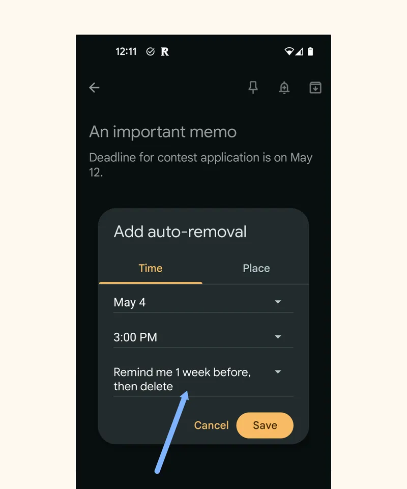
(In the absence of all that, snoozing could be a partial solution.)
As for the convert to permanent action that I suggest for important non-urgent & transient notifications—temporary bits of information that you don't want to lose—we have a few partial solutions.
If it's a website you want to retain, you can bookmark it, but good luck keeping those organized. There are specialized save-for-later apps like Readwise, Pocket and Omnivore, and they mostly focus on written content. There is Pinterest for images, but it's a nasty SEO-spammy walled garden. Nothing really general.
A few note-taking apps do have pretty good data ingestion systems allowing you to throw information in and easily categorize it. I'm thinking especially about Evernote's excellent quick capture functionality, which provides first-class input interfaces for text, emails, voice, pictures, and other formats. (Sadly the company is now nearly defunct because of bad management and—among other things—for being so rigid compared to newer options).
I'm wishing modern tools like Obsidian and Logseq would take a lesson from the old guard here. That would turn them into powerful permanence wells, and their rich features make organizing and rediscovering things a breeze.
Urgency Flags
There is one last notification problem I hope future software infrastructure will solve: there is no way to automate actions based on urgency.
Unlike importance, urgency is a rather objective property of a message. It's either time-sensitive or it isn't. In principle, the producer of a notification knows its true level of urgency, so what if the system allowed them to flag it accordingly?
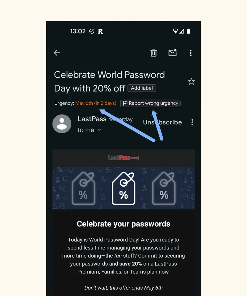
This would let the client automatically apply different strategies on a case-by-case basis. The OS or app could give you the option to mute only the non-urgent notifications, while letting the pressing messages through. You could have advanced options that auto-snooze non-urgent items until the weekend, or sets deadlines for them based on certain criteria. Urgent items within certain categories (e.g. news) could be made transient by default. A lot of possibilities would open up.
Of course, certain actors would still have an incentive to fake urgency. But by incorporating urgency into protocol, we would have methods for punishing the liars. At least for email, we already have mechanisms in place to track and impact the reputation of email senders: if they spam too much, they'll eventually be sent to the spam box. Imagine having a second button alongside "report spam" saying "this isn't urgent". It could make for a softer version of spam control, adding granularity for the senders you don't necessarily want to block out altogether.
Notifications Are Hard
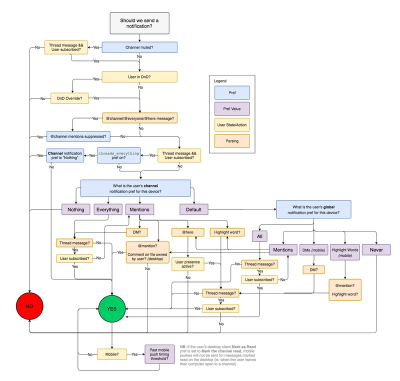
Notifications are surprisingly hard to get right. This is how Slack does it:
More than once in this post I've dreamed out loud of OS-level solutions and new universal protocols. Those things are both unlikely to happen any time soon. At the end of the day, every program and every communication channel is different, and it may be impossible to produce a full integration like that. Still, if this "Urgency-Transience-Importance" is of any use to clarify even one product designer's—or anyone else's—ideas, it has done its job. ●
Cover image:
Photo by Super Snapper, Unsplash
 TechnologyFramings and ModelsMind